
Renaming & Repositioning a Regional Energy Company
BRAND STRATEGY & POSITIONING | BRAND NAMING | BRAND VERBAL IDENTITY & TAGLINE

Client:
The Approach
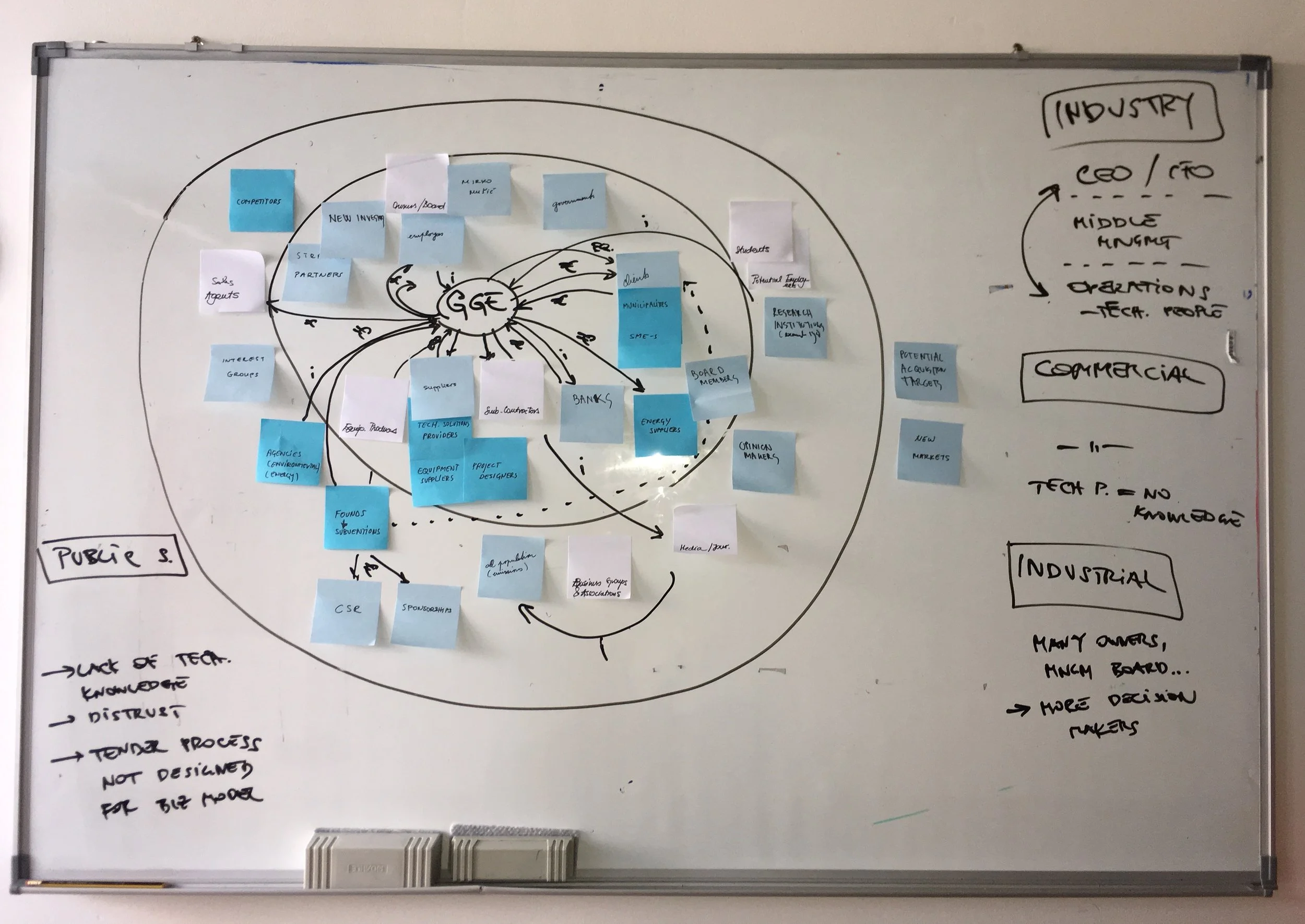
We started with a branding workshop to uncover GGE's core purpose using Simon Sinek's "Start With Why" framework—because people, even in B2B markets, connect with companies that stand for something beyond profit.
Through collaborative sessions and research, we articulated their fundamental purpose: maximizing clients' energy efficiency and sustainability.
This became the "why" that would inform everything else. We then defined the "how"—their unique approach of guaranteeing results through independence from suppliers, multidisciplinary expertise, and established financing partnerships—and the "what"—delivering end-to-end turnkey energy services that are risk-free and investment-free for clients.
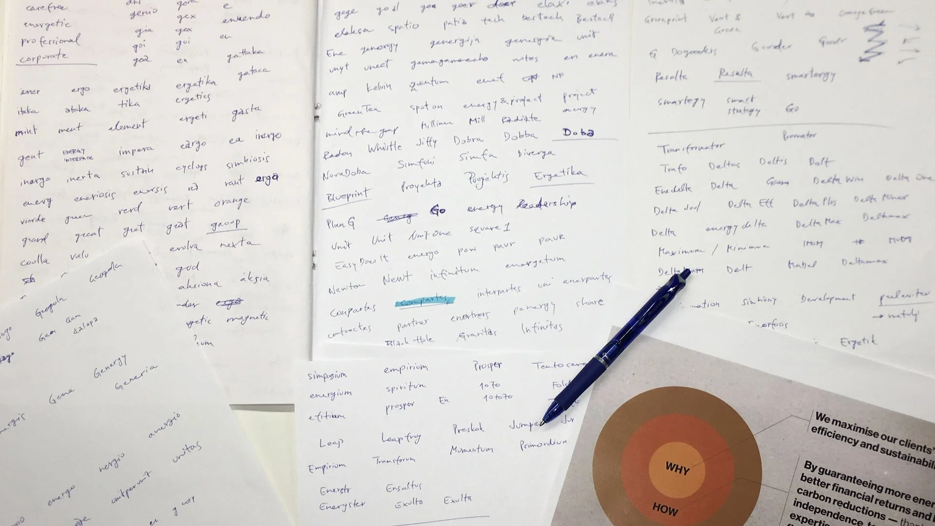
With this positioning established as our criteria, we approached naming strategically. The naming development process focused on three requirements:
unambiguous pronunciation across all European markets,
regionally neutral sound, and
communication of the positioning while appealing to executive decision-makers.
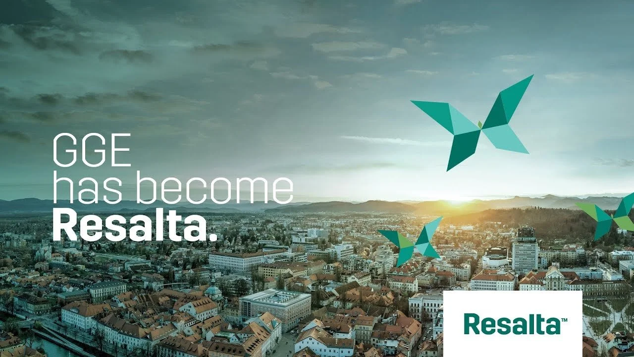
The chosen name "Resalta" checked all the boxes, while emphasizing the results GGE delivers to partners. Naturally, the name was vetted for trademark availability and domain registration.
The Project Goal
GGE was planning regional expansion across Europe, but a critical obstacle emerged: another company in the same category was already operating under the same name in target markets.
But before we could solve the naming problem, we had to solve a more fundamental one: articulating their purpose in a way that could guide every decision the company makes, from how they pitch clients to how they hire employees.
We needed to work from the inside out, establishing why the company exists before determining what to call it.
The Outcome
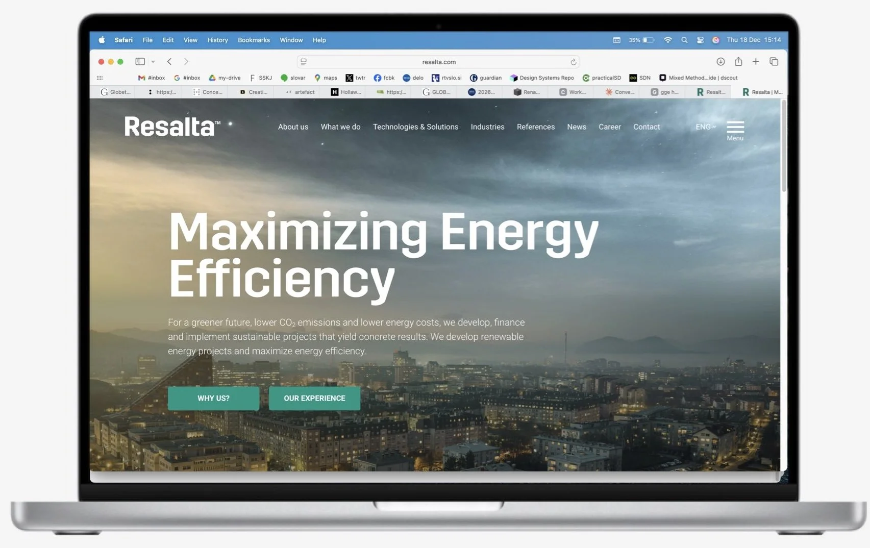
The client approved "Resalta" as their new brand name, which successfully communicated their value proposition—helping clients' businesses leap forward through energy efficiency—while meeting all practical requirements for international pronunciation and availability.
But the real value wasn't just in the name itself; it was in the process that got us there. By establishing purpose and positioning first, we gave the company a decision-making framework that extended far beyond the rebrand.
Their "why"—maximizing energy efficiency and sustainability—became the lens through which they could evaluate every activity at every touchpoint, from sales conversations to partnership agreements.
This approach exemplifies purpose-driven branding: when you start with clarity about why you exist, the how and what follow naturally, and naming becomes a strategic expression of that purpose rather than an arbitrary creative exercise.
The brand identity (logotype, sign, etc.) was designed by Gigodesign.